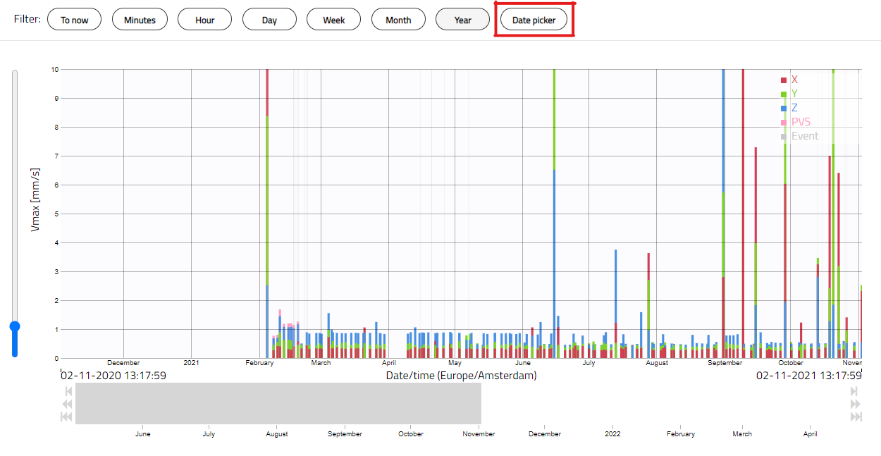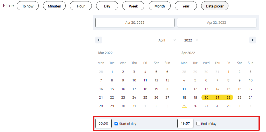
Clicking on the Date Picker opens a calendar where you can choose the time frame you want to display in the graph. The selected dates will be highlighted in yellow. You can display the entire day or a specific period within the day. To choose a particular period, untick the 'start of day' and/or 'end of day' boxes below the calendar (highlighted in red in the picture below) and enter your preference. The choice made here applies to every day within the time frame and cannot be selected on a per-day basis.

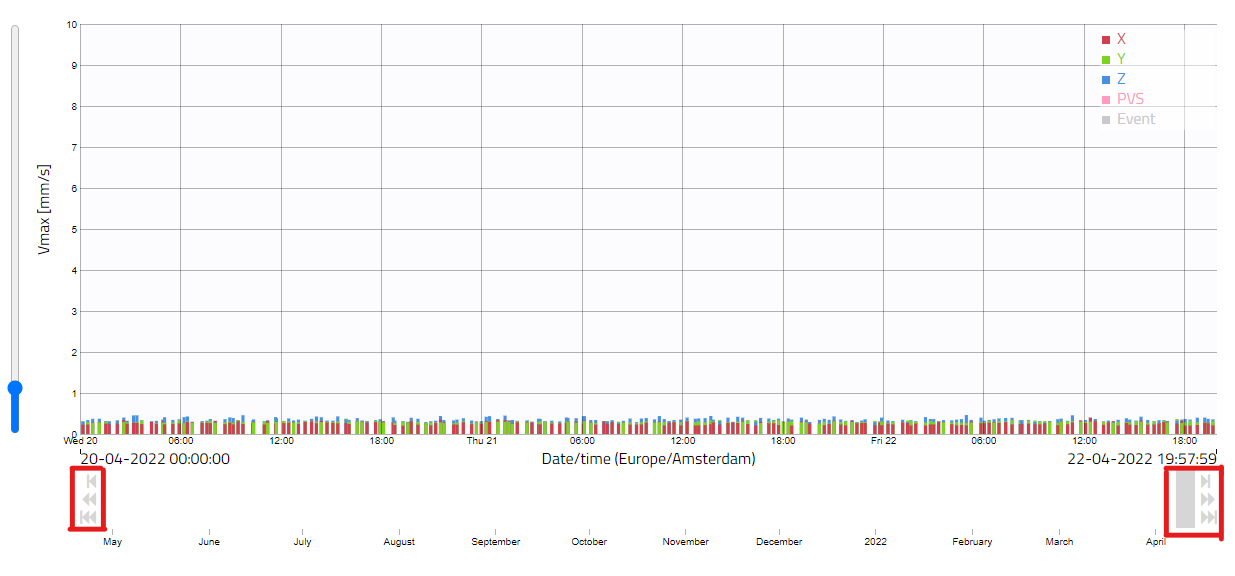
You can move the custom time frame by a day, week, or month. To do this, click on the corresponding arrow under the graph, as highlighted in red below.

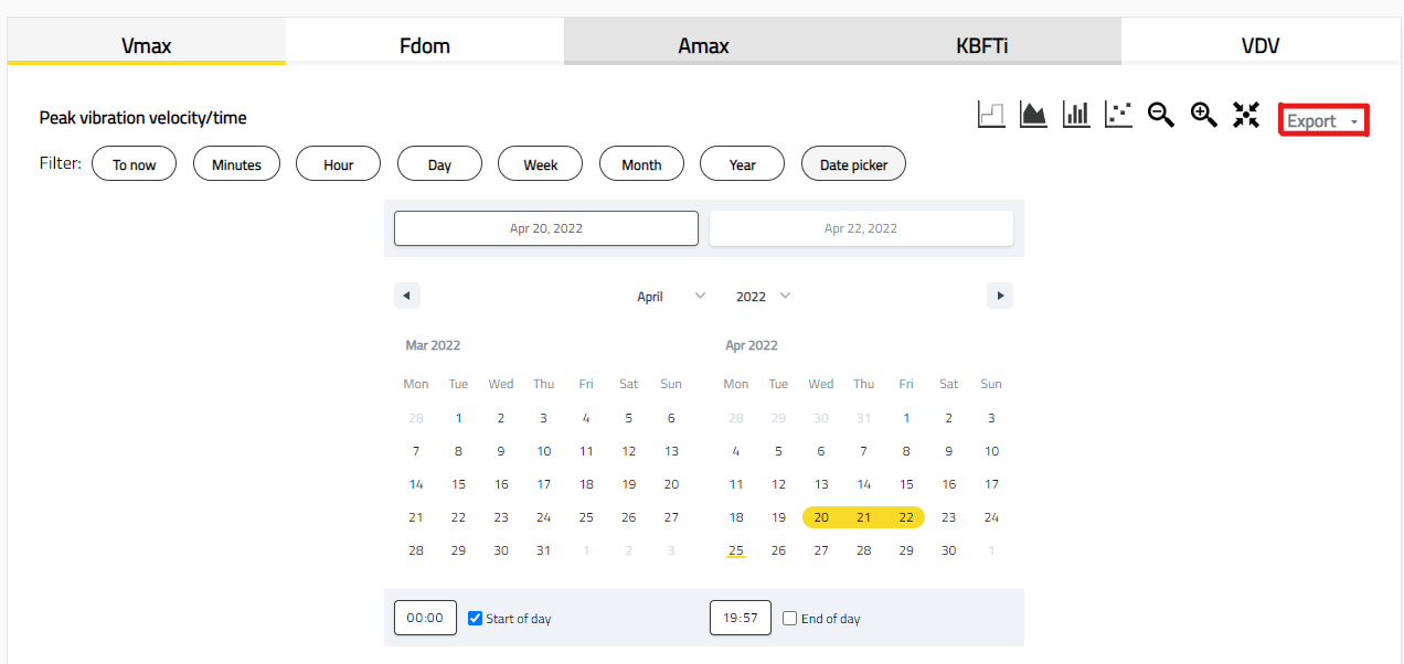
To create a PDF report of this custom view, click on the 'Export' button above the graph (see picture below). The downloaded file contains the same time frame and information shown in the graph view. To download the report as an Excel file or CSV document, click on the 'Export' button and confirm the custom period before exporting.

If you have questions about this new feature or the Honeycomb platform, we will happily schedule a meeting with you!